Visualising Speech
Using Python libraries to visualise audio

There are several Python libraries available that make it very easy to view waveforms in different ways. In this post, I’ll go through some of the ways to get started.
To begin, import the key libraries:
import matplotlib.pyplot as plt
import numpy as np
import pysptk
from scipy.io import wavfile
For the audio, I used Audacity to record the short phrase “What’s today’s weather?” as a wave file. I’ll use scipy to read in that wave file, and matplotlib to visualise it.
wavfn=”weather.wav”
fs, x = wavfile.read(wavfn)
y = np.linspace(0,len(x)/float(fs), len(x))
ya = np.max(np.absolute(x))
plt.plot(y, x, color="#004225")
plt.xlabel("Time (seconds)")
plt.ylabel("Amplitude")
plt.ylim(-ya, ya)
plt.xlim(0, y[-1])
plt.show()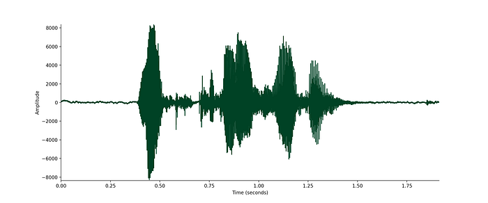
This first plot shows the waveform in the time domain. It’s easy to see the silence at the beginning and end of this clip, but to see what else is going on I need to zoom in and get a closer view.
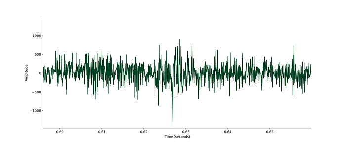
The first place to zoom in is the point at around 0.6s. This corresponds to the /s/ at the end of the word “what’s”. There’s not really a lot of structure to see here. In fact, this part of the audio looks a lot like random white noise.
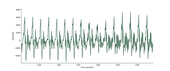
In comparison, zooming in around 0.85s focuses in on the /eɪ/ of “day”. This part of the audio looks quite different — you can clearly see the repeating pattern.
Even with zooming in, there’s only so much you can see in the time domain. Matplotlib has its own spectrogram function to let us see what’s going on in the frequency domain. A spectrogram plots time on the x-axis, and frequency on the y-axis. The colour shows the amount of energy for particular frequencies at particular times.
powerSpectrum, freqenciesFound, time, imageAxis = plt.specgram(x, Fs=fs)
plt.xlabel(‘Time (seconds)’)
plt.ylabel(‘Frequency (Hz)’)
plt.show()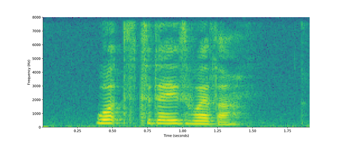
In this spectrogram, the yellow regions denotes high energy, while blue shows low energy. Looking closer at the region around 0.6s that corresponds to the /s/, you can see that the entire spectrum here from 0 to 8,000Hz is a green colour, showing that there’s a medium amount of energy spread across all frequencies. Compare this to the region at 0.85s, where the /eɪ/ sound is, and the spectrogram looks quite different. At 0.85s there are clear bands of yellow at distinct frequencies and blue at others.
The /s/ is an unvoiced sound, meaning that our vocal cords don’t vibrate when we say it, and so it has no harmonic component. The /eɪ/ is voiced. Our vocal cords vibrate while making this sound, and so those yellow bands correspond to the frequencies that are strongly present. The lowest of these is called the fundamental frequency (f0), and the higher frequency ones are harmonics. You can actually feel the vibrations of your vocal cords, or lack thereof, if you put your hand on your throat while saying these sounds.
Using pysptk, I can go further and estimate the fundamental frequency over the audio clip.
f0 = pysptk.rapt(x.astype(np.float32), fs=fs, hopsize=80, min=50, max=450, otype=”f0")
y = np.linspace(0,len(x)/float(fs), len(f0))
plt.plot(y, f0, linewidth=3, color=”#004225")
plt.xlabel(“Time (seconds)”)
plt.ylabel(“Fundamental Frequency (Hz)”)
plt.xlim(0, y[-1])
plt.show()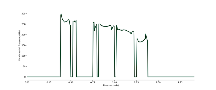
In this plot of f0, it’s clear to see where the audio is voiced and where it’s unvoiced. For some periods of time, corresponding to voiced speech, the fundamental frequency is between 200 and 300Hz. At other times, for the unvoiced speech, it’s down at 0Hz. Hence, to take the average f0 for the audio I need to ignore parts that have a value of zero.
mean_f0 = np.true_divide(f0.sum(0), (f0 != 0).sum(0))The average f0 for my “What’s today’s weather?” sample is 228.4Hz.
Fundamental frequency varies a lot for any speaker as they speak, and it also differs between speakers. We convey a lot of information as we speak by our intonation — i.e. how we say something rather than what we say — and fundamental frequency is a big part of that.
I took a large dataset of audio and estimated mean fundamental frequency for each of the utterances in the set. This particular dataset contains adult UK English speech across a number of dialects, and below is a histogram of the f0 distribution.
bins = np.linspace(70, 275, num=100)
plt.hist(all_f0, color="#004225", bins=bins)
plt.xlabel("f0 (Hz)")
plt.ylabel("Count")
plt.show()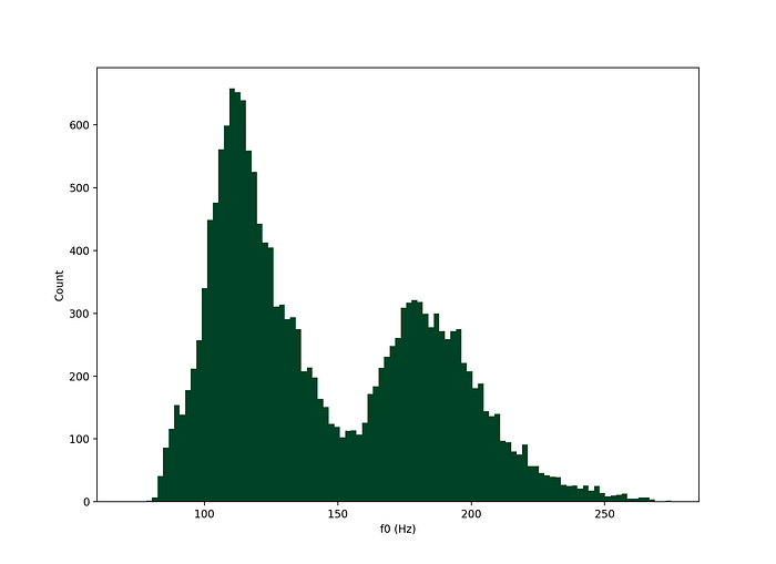
Fundamental frequency has a bimodal distribution, with peaks in this set at around 120Hz and 180Hz.
Speech is a complex audio signal, and there’s loads more to dig in to beyond this short introduction. Modelling speech is a key part of technology like automatic speech recognition or text-to-speech, and so working with audio has many real-world applications.
You can hire me! If I can help your organisation use AI & machine learning, please get in touch.

